


Homemade Method is an initiative by the founder Anna Rakoczy to help women in their 50s, 60s & 70s lose weight and lower high blood sugar, pressure, and cholesterol without dieting.
I took over the design responsibility of the recipe app project and applied a user-centered approach to design the user experience and the interface of the new registration flow.
Problem
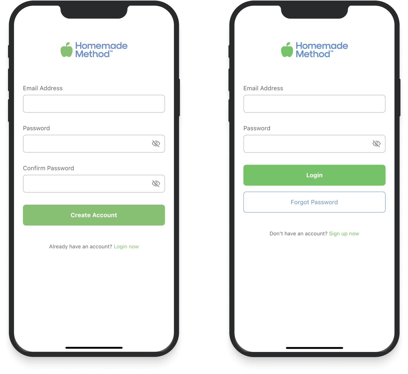
The current registration flow needed to be improved to make it more intuitive and easier to register and log in, and a paywall screen had to be added at the end of the registration process as a part of the feature.
CURRENT DESIGNS
Method
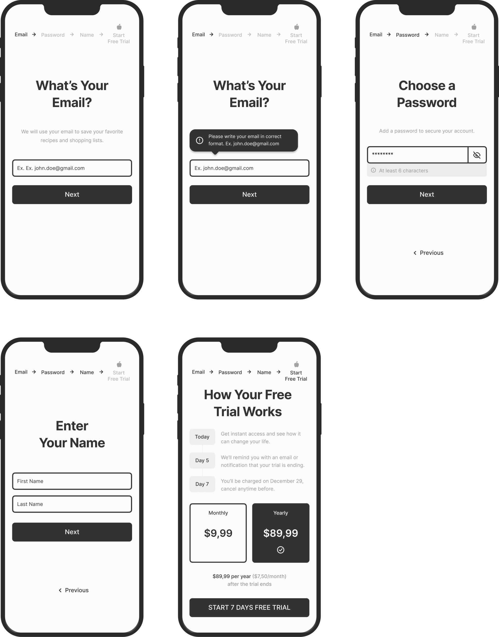
Knowing that the user group is over 50 ladies, creating a clean and clutter-free layout was essential. I started with wireframes to explore options and define how the steps should look.
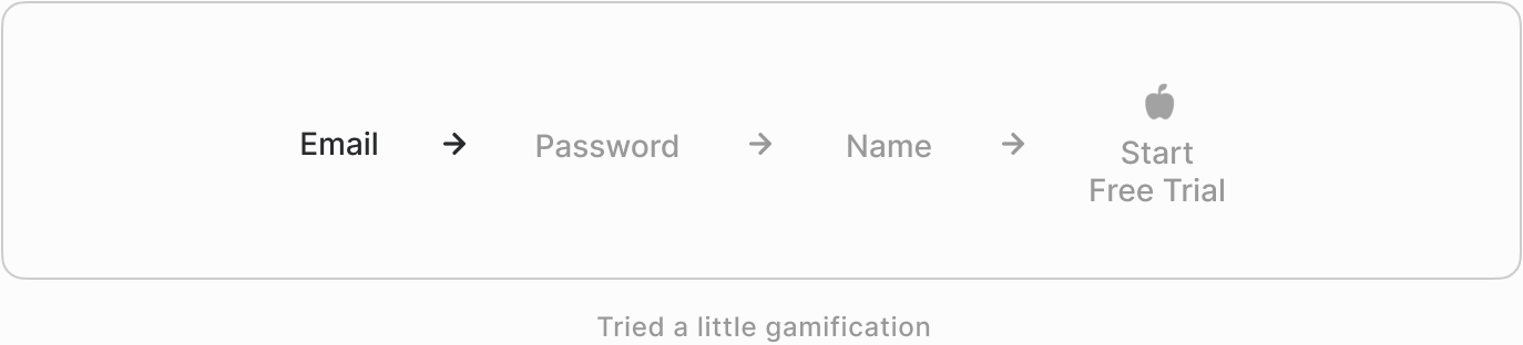
Iteration #1
The first iteration was about placing the information in the layout and finding solutions for our requirements. Initially, our focus was on finding a good way to display the breadcrumb section at the top of the screen.
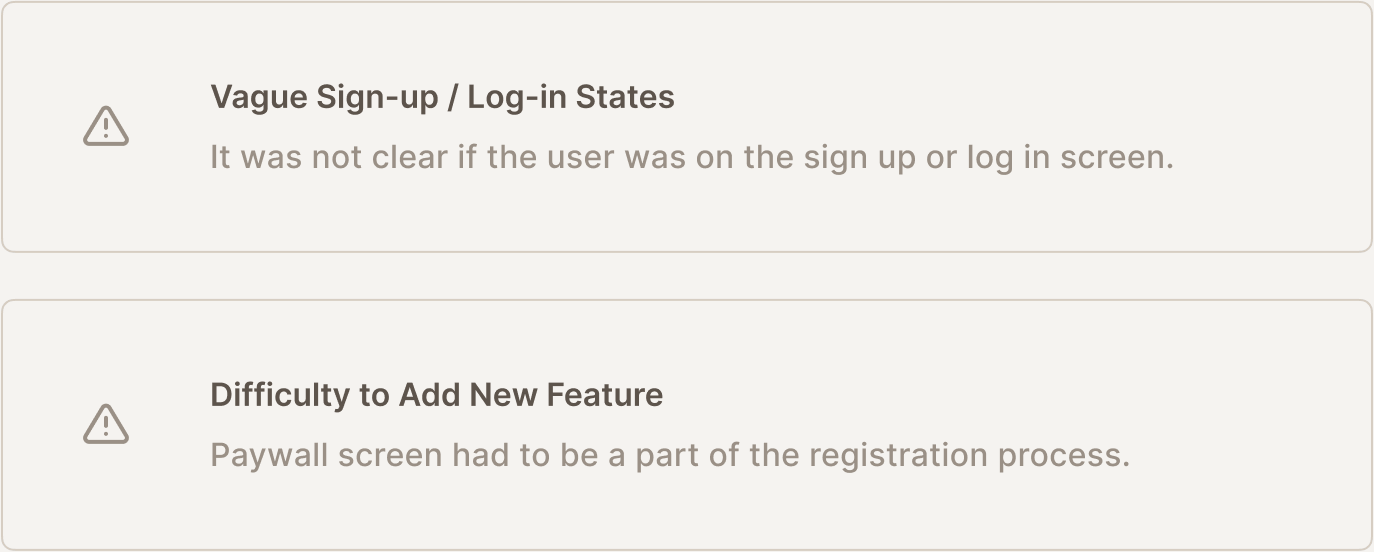
CHALLENGE
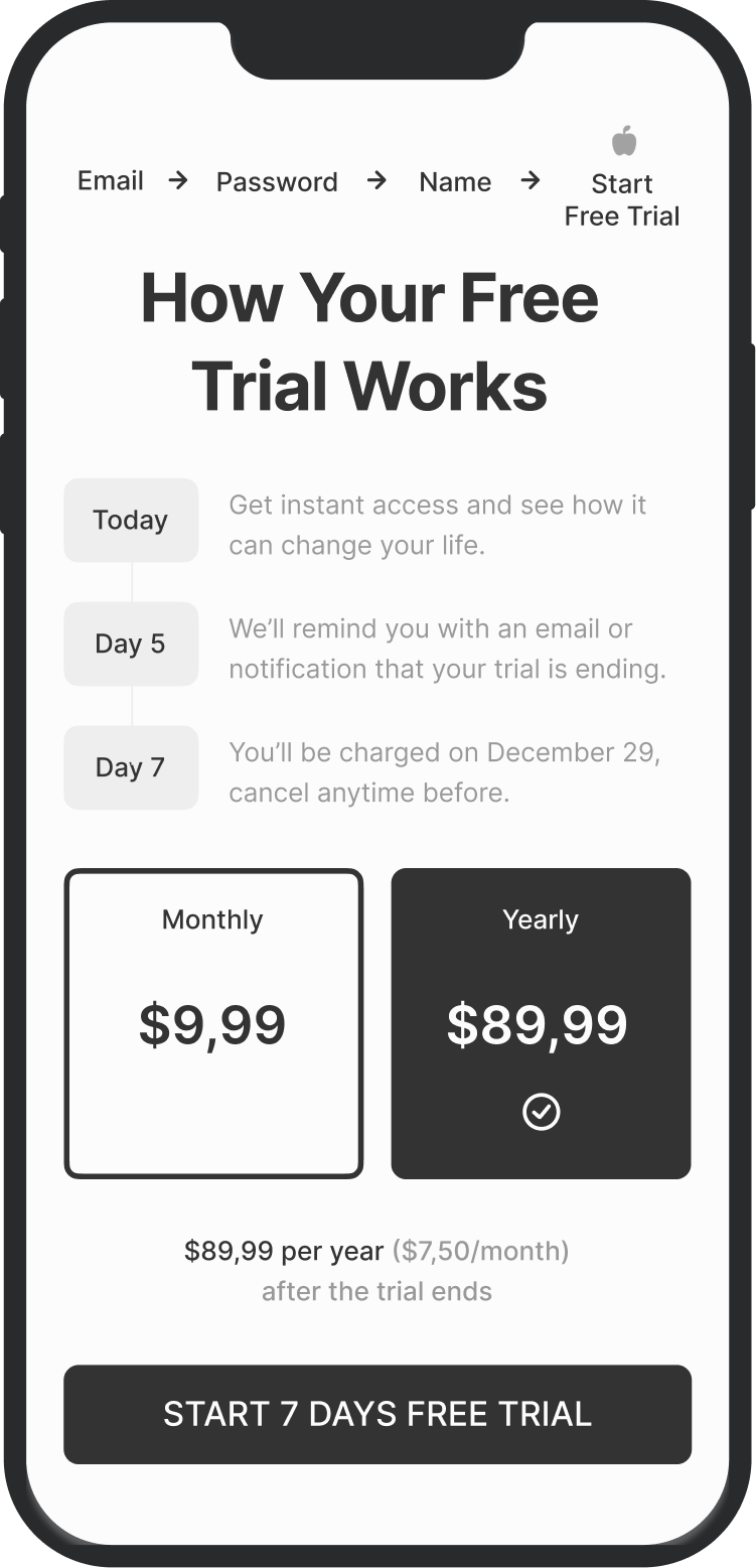
The paywall screen was challenging since many information blocks needed to be open and visible to the users, so they understand what happens when they subscribe.
Iteration #2
Explorations continued trying to simplify the steps as much as possible while guiding the users throughout the journey.


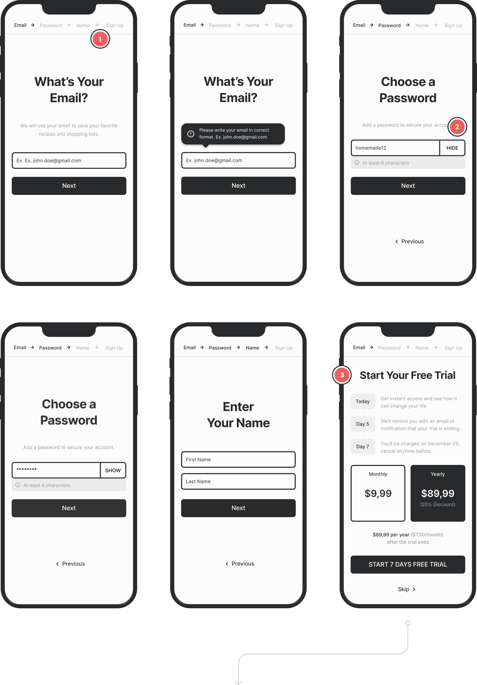
Still too crowded. We looked for ways to clean up the design by removing unnecessary or less critical elements from the layout. The apparent solution was removing the step indicator from the top of the screen.
CHANGELOG
- We needed a simpler version of the step indicator. We also thought about not showing it at all, but it was necessary to display to users how many and which steps are left to complete the sign-up.
- Instead of using an eye icon to hide/show passwords, we used open text, writing “Show” and “Hide,” considering over 50 audiences may have difficulty figuring out what the icon means.
- Updated the copy and checked if it’s possible to keep the step indicator on the last step.
At this point, we reviewed the wireframes and decided to start designing screens so that we could make minor adjustments during the styling.
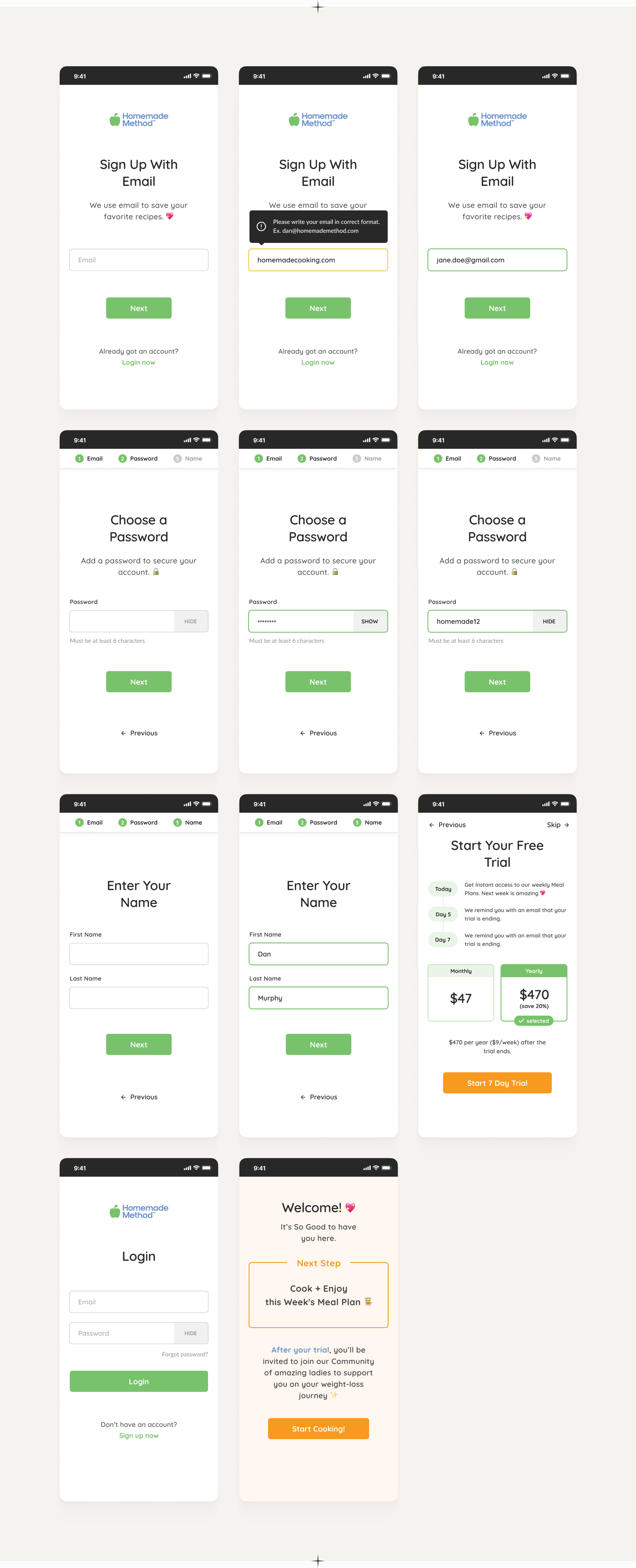
Designs
There was a significant change during the design process. Initially, a separate page was planned to trigger the sign-up and log-in flows, but due to marketing reasons, the business owners decided to use the landing page as a starting point for the registration flow.
I adapted to this change and devised new solutions to fix the problem.
Result?
Good work, happy clients.
Let’s build something great together.